How Spaceflow developed its unique visual identity

5 minutes read

We just announced our Series A funding round, and with this big step forward also comes a lot of reflection on where we’ve been and where we came from as a company. Central to that journey is the story of our graphic design evolution, so as Spaceflow’s graphic designer, I want to share some thoughts on how our visual identity has changed as we’ve grown. 

Our design inspiration 

I joined Spaceflow at the beginning of the company and back then, no one knew what our identity should be. Everyone was young, the team was just starting out, and I had a lot of leeway to try to create what would best serve our brand. 

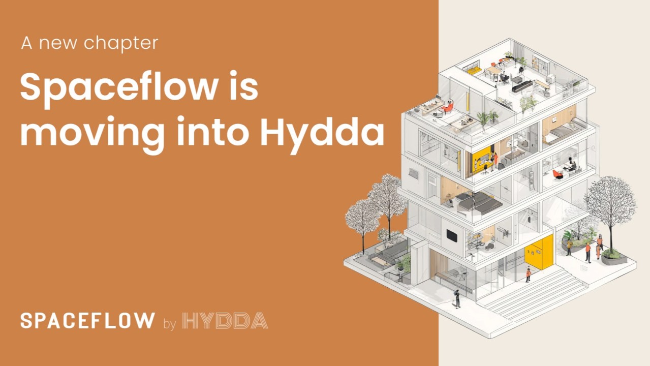
More than anything, I want to communicate friendliness and kindness with a minimalist look. We don’t beat around the bush with customers, and so it was important our visual language matched that: easy to understand, direct, and to the point. That’s why we landed on using an illustration-heavy style, which communicates information as well as photographs while seeming warmer and more inviting than the typical corporate stock image look. 

For me, design has always been a process and we’ll only continue to refine our identity as we keep growing. I worked through a lot of different visual identity iterations before we came to one that really clicked but my overall approach was to actually design for our own team, not just our market. My philosophy is that if the people building the product are happy with the design, our customers will be too. 

Our visual identity

From the beginning we really leaned into the “space” side of our name with a lot of black, reminiscent of outer space. As our team grew we switched to a white-based design which reads as cleaner and more permanent. 

Also, because our platform focuses on how people use their buildings, there were always people central to our design as well. I tried several different takes before finally arriving at the character style you see in our design today.

Our newest design features stylized characters with very big feet. When I was developing this design everyone had an opinion about it. I found that some people love it and some people don’t like it but here’s the thing: Either response is a success in my book. Love it or hate it, our character design interests everyone. People have opinions because it is eye-catching and that is a good thing.

How design fits into our culture

I said earlier that I built our design around our own team first. That doesn’t just mean the illustrations and colours we use on our website, it has impacts every part of how we look and present ourselves. Take our company swag for instance. So many companies give their employees or visitors shirts, gadgets, and other swag that either looks boring, looks totally over the top, or simply isn’t made well. Employees often end up wearing their company shirts to sleep or work out in and that’s it. 

We wanted to avoid that. We wanted our employees to actually wear their Spaceflow sweatshirts and tote bags and other pieces out and about, so I designed printed t-shirts that are minimalistic, sleek and professional yet still say Spaceflow loud and clear. We’ve gotten great feedback so far and in the future I want to take this to the next level with unique designs for each team and even artist collaborations. 

Design is a powerful thing, and acing it for both our employees and our clients is challenging, especially with so much change and growth going on. It’s also far from set in stone. While our visual identity will no doubt continue to evolve, this is how we built our look from founding to Series A, and we’re all excited to see what comes next. 


01. July 2022
5 minutes read

SIGN UP FOR MORE NEWS 
FROM SPACEFLOW

Join the Spaceflow community! Get the newest insights & articles on tenant experience and more in your mailbox.